Forum Feedback  Skilled Seducer 2022 Theme, First Draft: Like, Dislike, Feedback?

Chase

Chieftan
Staff member
tribal-elder
Joined
Oct 9, 2012
Messages
5,484
Hey fellas,

I asked our designer to take a crack at a new look for the SS Boards.

I'd like to get your opinions -- like, dislike, any feedback you have, etc.

Note that all forums will of course still be there (they just aren't all here in the mockup). Forum icons will also get a makeover, becoming larger / more square to better fit the design (existing icons are still used in this mockup for now).

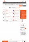
Here's Draft #1:

mockup-skilled-seducer-2022.png
 

Train

Chieftan
tribal-elder
Joined
Feb 3, 2020
Messages
467
I like the design layout, but I think some more color in it would be nice so it doesn't look too blank/white.

The forum stats section I'm not sure would be of much use to regular members imo so maybe that real estate could be used for some other feature. Maybe like a PM preview window/box? Or preview of latest posts as well would be helpful.

Integration with the GC articles side of the site would be cool too because guys in the chat often refer and discuss articles live. But this is a minor wishlist item that can be worked around with another tab or something.
 

Regal Tiger

Cro-Magnon Man
Cro-Magnon Man
Joined
Mar 16, 2015
Messages
1,018
I like the design layout, but I think some more color in it would be nice so it doesn't look too blank/white.

The forum stats section I'm not sure would be of much use to regular members imo so maybe that real estate could be used for some other feature. Maybe like a PM preview window/box? Or preview of latest posts as well would be helpful.

Integration with the GC articles side of the site would be cool too because guys in the chat often refer and discuss articles live. But this is a minor wishlist item that can be worked around with another tab or something.
While I don't really use the chat part of the forum I have to second this. Having some integration would probably be a great boon, especially for the newer members. Not sure about implementation, but definitely something I think would help :)


Also, as long as 'new posts' and 'mark forums read' are both clickable buttons, I'm good lol
 

Starboy

Tool-Bearing Hominid
Joined
Apr 2, 2018
Messages
485
I personally don't like how bolded it appears in the thread titles. Also I don't fancy the font style of the words idk it looks cartoonish to me. As for the share option who from here is gonna be sharing a link called skilled seducer to their facebook lol
 
Last edited:

Will_V

Chieftan
Staff member
tribal-elder
Joined
Jan 24, 2021
Messages
1,539
Hey fellas,

I asked our designer to take a crack at a new look for the SS Boards.

I'd like to get your opinions -- like, dislike, any feedback you have, etc.

Note that all forums will of course still be there (they just aren't all here in the mockup). Forum icons will also get a makeover, becoming larger / more square to better fit the design (existing icons are still used in this mockup for now).

Here's Draft #1:

View attachment 246

I like the direction it's heading, bordering the sub-forums is great, overall it looks way more impressive. But there's a lot of competition for attention in terms of different levels of contrast, different colors, lots of bolded font.

I also think the organisation of things toward the top before reaching 'The Boards' could be more efficient so as to bring the content toward the top.

Lastly the notification icon is probably better as red, I didn't notice it immediately.
 

Chase

Chieftan
Staff member
tribal-elder
Joined
Oct 9, 2012
Messages
5,484
Awesome guys, this is super valuable feedback.

A few guys put things into words here I felt but wasn't quite sure how to articulate. Like the excessive white/blank space making the forum feel inactive, empty, etc. Or the competition for attention from the various elements.

Good observation on the notification color, I didn't even catch that one.

We definitely don't need a social share box, yeah :D

Can save that space for something else.

Got everything everyone dropped here over to our designer. Didn't really see any comments from members here I didn't agree with.

I'll get a night version up for you fellas to critique once we've made these changes and probably designed the forum & thread pages.

Chase
 

Troy

Tool-Bearing Hominid
Joined
Jul 11, 2013
Messages
730
@Chase

I have designed over 100 websites to date and so I will share my perspective both as a website designer and also my personal opinion. I will also keep the GirlsChase in daylight mode to give a fair comparison.

Logo

Present Look: I like how the current logo is in the middle of the page.

Mock Look: The logo to the left looks all small and weird, GirlsChase has an amazing logo. I would love for it to remain where it currently is and show the guy with the 2 beautiful ladies on his arms.

Top Icons

Present Look: The current icons look more of a 2010 to 2020 look.

Mock Look: I have seen a trend of websites getting that more animated, material design icon look. I like it. So it can stay. What I would love to see remain is the words under them - Name, Inbox, Alerts. Having the words is just my personal preference (If others vote against the words being there, I would recommend having the developer create a setting so persons can choose to turn it on and off). Some websites I visit, only have icons and I have to memorize what they are. Which I hate doing. I am way too busy to be memorizing which icon does what, thats just my personal peeve.

What I do like about the new design is the small dropdown arrow, which makes it more obvious that is the button to press to log out, change settings, etc.

Daylight/Nighttime Icon

Present Look: I dont know whose idea it was to put a half moon inside of a dark space. I am seeing a cresent moon which has some yellow with a small smily face moon. And a little red on top. The current moon look is horrible to be honest. There is a speck of white to the left of the moon which almost resembles a man walking on the moon. It is so small and difficult to view, its just horrible in my opinion.

When I change to the night mode though, I absolutely love how the sun icon is clearly visible. The blue background colors resembling the sky is also very nice with the sun smiling. Keep that look!

Mock Look: I like the shape of the icon. It looks like the new versions I see on some websites, where the button can be pressed, and the change from day to night can happen without the page having to reload. I like how it looks on the mock look. I may be wrong, maybe the page still does reload, but overall it is nice. Only thing again, keep the current sun look. Change the night look to something more visible.


Header - Skilled Seducer Boards

Present Look: I dont fancy how the words are put to the left of the screen and are so small. It does not stand out.

Mock Look: Yes perfect. The color change from black to orange is also a wonderful change. The font size is just right. It makes the website look more vibrant.

Forum Stats

Present Look: I do love statistics, but when it comes to a brand I already trust, I dont care about how many members a website has, how many messages, or treads there are. The reality is, what am I going to do with this information? Nothing to be honest. I already trust GirlsChase so this info is not something I need.

However from a marketing and business standpoint, it is great to have these statistics as it shows: authority, credibility, social proof, and trust. So keep it. Members who are new to GirlsChase will clearly see this is a professional place where likeminded men meet to discuss seduction, lifestyle and other topics.

Mock Look: I love the design of the new statistics. However please ask the developer to add back the "new member". I think it is great when we have a new member and we can welcome that new person.

The stats numbers are big, bold and nice. The icon images beside treads, messages, and members looks nice. The color code also perfectly matches GirlsChase.

Members Online

Present Look: The look is very simple and to the point. Personally I am very busy so sometimes keeping things simple is best. And I think the current look does this very well.

Mock Look: Lol this is pure comedy and I am here for it. @ZacAdam and @Skills images look like PSY from Gangnam Style, @Tayo image looks like one of those guys from Bob the Builder cartoon, @POB looks like Eminem, the 3rd image looks like Da Baby (artist), and the last image looks like a darker shade of Drake.

Lyrics } "Troy way too sexy for these girls, Im way too sexy for my shirt, Im way too sexy for this world, way too sexy for these boards...way too sexy" Lol

Ps. Speaking of Drake, I cant wait till he drops those hot and spicy condoms. The hotter the better, lots of pepper lol. Whoever is designing this, some comedy and cartoon is running wild in their mind, and I am here for it lol.

One thing though, there are thousands of members, and any one person can change their image at the same time. Suppose 2 members decide to have the same pic of Sean Connery as their DP pic, then it would be difficult to quickly know who is online. I would prefer to still be able to see the names of persons who are online without having to hover over any images or clicking any links.

Ribbon (Home, Forums, What's New, Members, Chat)

Present Look: The font and style of the entire section looks good to me. No complaints.

Mock Look: Again no complaints. I will say I do like how the number of chats is in a yellow circle. That looks more vibrant, than a red rectangle. There are actual studies that show the color yellow does influence people to take action faster. And I think the yellow does a wonderful job here. It may cause members to more rapidly click their alerts and messages.

Look at Amazon.com, I used to work for them. They use the color yellow as their checkout button for a reason. That color change is one of the reasons Amazon makes so much damn money lol.

Ribbon (New Posts, Find Treads, Search Forums, Watched, Mark Forums Read)


Present Look: I actually really like the font size, and white text. The red background has stuck in my mind as a GirlsChase color. I would keep that. Its absolutely amazing.

Mock Look: Wow, too much white now, the background does not remind me this website belongs to Chase Amante and Girls Chase members. It looks like some foreign forum. I think the red is symbolic with GirlsChase at this point.

Share This Page

Present Look: Maybe the fact that this was pushed to the bottom of GirlsChase is one of the reasons I never used it before. Another reason is I simply dont talk about seduction with other people outside of GirlsChase. Lets go back to an article that talks more about this: https://www.girlschase.com/content/dont-talk-about-pickup-other-people

But even before @Chase released this article, I had no reason to talk about seduction with people who are not already inside this space. I think this feature is good for those on the website who have friends outside of GirlsChase who you are interested in seduction, it would be a quick and easy share. But God as my witness, I aint sharing this page to Facebook so my Mom and my girls I am interested in can see I am learning how to get women.

I am sure I would get some phone calls about this. (Sorry I just realized I strayed from providing just feedback on the design). To conclude, I think the share icons in gray is an older look.

Mock Look: The colors are more vibrant, that is great. When I design websites, I also like to add the share links with color. To be honest, I have never used this feature of GirlsChase. @Chase I would recommend using a tool to track how many persons on the boards are actually engaging and using this feature.

When I design websites, I have used:


(Wish I was affiliated with these companies to get the commission for recommending them, but haha it is what it is. Yours truly, I share from the bottom of my heart).

Latest Posts | Latest Profile Posts

Present Look: Looks nice to me. It is very simple and to the point. One thing I never liked though was how the other words were never in Capital Letters.

Mock Look: The light gray background is a nice change. It is still simple, but looking more 2022 compared to other websites. I also love the font style. As mentioned above, I dont like when each word in a header is not bolded. To conclude:

I dislike: Latest posts / Latest profile posts

I like: Latest Posts / Latest Profile Posts

The Boards

Present Look: I do love the little ball rolling around in the circle thing. It makes the website more engaging. The images selected to represent each board is also very nice. The font is also perfect in my opinion. I would have preferred if the title of a post was more visible. Sometimes I am in a rush, and a particular topic may stand out to me. And so if I can help a guy or 2 on here real quick, I need to see the more of the title to make a quick decision if I have enough real world experience to do so.

Mock Look: I get that the developer is attempting to line up the edge of the Boards with the search and forum stats. Thats a great idea so it looks even and nice. But I dont like how there is all that empty white space to the left of the boards. Why? Just Why? I would ask the developer to stretch it out so more of the title of a post can be previewed. My guess is other guys on here are busy as well and would still love to help guys where they are experienced. So I think it would be a great idea to show more of that so we can help each other faster.

Alright there you have it. My feedback. If anything else comes to mind, I will edit and notify. P.s. @Chase I have not been able to add images to my posts, I was hoping to take detailed screenshots on my computer and attach throughout the post. Is it possible for 2022 to allow Google Drive links to be embed? The reason is I currently pay for Google Drive, and I like having control over my content. Also the media approved sites eg. Instagram I have not been able to copy a link and paste on here. Its not showing up. Hopefully an admin could help me figure this out so my posts can be more dynamic and interesting.

Troy
 
Last edited:

Skills

Tribal Elder
Tribal Elder
Joined
Nov 11, 2019
Messages
4,211
Location
South Florida
@Chase

I have designed over 100 websites to date and so I will share my perspective both as a website designer and also my personal opinion. I will also keep the GirlsChase in daylight mode to give a fair comparison.

Logo

Present Look: I like how the current logo is in the middle of the page.

Mock Look: The logo to the left looks all small and weird, GirlsChase has an amazing logo. I would love for it to remain where it currently is and show the guy with the 2 beautiful ladies on his arms.

Top Icons

Present Look: The current icons look more of a 2010 to 2020 look.

Mock Look: I have seen a trend of websites getting that more animated, material design icon look. I like it. So it can stay. What I would love to see remain is the words under them - Name, Inbox, Alerts. Having the words is just my personal preference. Some websites I visit, only have icons and I have to memorize what they are. Which I hate doing. I am way too busy to be memorizing which icon does what, thats just my personal peeve.

What I do like about the new design is the small dropdown arrow, which makes it more obvious that is the button to press to log out, change settings, etc.

Daylight/Nighttime Icon

Present Look: I dont know whose idea it was to put a half moon inside of a dark space. I am seeing a cresent moon which has some yellow with a small smily face moon. And a little red on top. The current moon look is horrible to be honest. There is a speck of white to the left of the moon which almost resembles a man walking on the moon. It is so small and difficult to view, its just horrible in my opinion.

When I change to the night mode though, I absolutely love how the sun icon is clearly visible. The blue background colors resembling the sky is also very nice with the sun smiling. Keep that look!

Mock Look: I like the shape of the icon. It looks like the new versions I see on some websites, where the button can be pressed, and the change from day to night can happen without the page having to reload. I like how it looks on the mock look. I may be wrong, maybe the page still does reload, but overall it is nice. Only thing again, keep the current sun look. Change the night look to something more visible.


Header - Skilled Seducer Boards

Present Look: I dont fancy how the words are put the the left of the screen and small

Mock Look: Yes perfect. The color change from black to orange is also a wonderful change. It makes the website look more vibrant.

Forum Stats

Present Look: I do love statistics, but when it comes to a brand I already trust, I dont care about how many members a website has, how many messages, or treads there are. The reality is, what am I going to do with this information? Nothing to be honest.

However from a marketing and business standpoint, it is great to have these statistics as it shows: authority, credibility, social proof, and trust. So keep it.

Mock Look: I love the design of the new statistics. However please ask the developer to add back the "new member". I think it is great when we have a new member and we can welcome that new person.

The stats numbers are big, bold and nice. The icon images beside treads, messages, and members looks nice. The color code also perfectly matches GirlsChase.

Members Online

Present Look: The look is very simple and to the point. Personally I am very busy so sometimes keeping things simple is best. And I think the current look does this very well.

Mock Look: Lol this is pure comedy and I am here for it. @ZacAdam and @Skills images look like PSY from Gangnam Style, @Tayo image looks like one of those guys from Bob the Builder cartoon, @POB looks like Eminem, the 3rd image looks like Da Baby (artist), and the last image looks like a darker shade of Drake.

Ps. Speaking of Drake, I cant wait till he drops those hot and spicy condoms. The hotter the better, lots of pepper lol. Whoever is designing this, some comedy and cartoon is running wild in their mind, and I am here for it lol.

One thing though, there are thousands of members, and any one person can change their image at the same time. Suppose 2 members decide to have the same pic of Sean Connery as their DP pic, then it would be difficult to quickly know who is online. I would prefer to still be able to see the names of persons who are online without having to hover over any images or clicking any links.

Ribbon (Home, Forums, What's New, Members, Chat

Present Look: The font and style of the entire section looks good to me. No complaints.

Mock Look: Again no complaints. I will say I do like how the number of chats is in a yellow circle. That looks more vibrant, than a red rectangle. There are actual studies that show the color yellow does influence people to take action faster. And I think the yellow does a wonderful job here. It may cause members to more rapidly click their alerts and messages.

Look at Amazon.com, I used to work for them. They use the color yellow as their checkout button for a reason. That color change is one of the reasons Amazon makes so much damn money lol.

Ribbon (New Posts, Find Treads, Search Forums, Watched, Mark Forums Read)


Present Look: I actually really like the font size, and white text. The red background has stuck in my mind as a GirlsChase color. I would keep that. Its absolutely amazing.

Mock Look: Wow, too much white now, the background does not remind me this website belongs to Chase Amante and Girls Chase members. It looks like some foreign forum. I think the red is symbolic with GirlsChase at this point.

Share This Page

Present Look: Maybe the fact that this was pushed to the bottom of GirlsChase is one of the reasons I never used it before. Another reason is I simply dont talk about seduction with other people outside of GirlsChase. Lets go back to an article that talks more about this: https://www.girlschase.com/content/dont-talk-about-pickup-other-people

But even before @Chase released this article, I had no reason to talk about seduction with people who are not already inside this space. I think this feature is good for those on the website who have friends outside of GirlsChase who you are interested in seduction, it would be a quick and easy share. But God as my witness, I aint sharing this page to Facebook so my Mom and my girls I am interested in can see I am learning how to get women.

I am sure I would get some phone calls about this. (Sorry I just realized I strayed from providing just feedback on the design). To conclude, I think the share icons in gray is an older look.

Mock Look: The colors are more vibrant, that is great. When I design websites, I also like to add the share links with color. To be honest, I have never used this feature of GirlsChase. @Chase I would recommend using a tool to track how many persons on the boards are actually engaging and using this feature.

When I design websites, I have used:


(Wish I was affiliated with these companies to get the commission for recommending them, but haha it is what it is. Yours truly, I share from the bottom of my heart).

Latest Posts | Latest Profile Posts

Present Look: Looks nice to me. It is very simple and to the point. One thing I never liked though was how the other words were never in Capital Letters.

Mock Look: The light gray background is a nice change. It is still simple, but looking more 2022 compared to other websites. I also love the font style. As mentioned above, I dont like when each word in a header is not bolded. To conclude:

I dislike: Latest posts / Latest profile posts

I like: Latest Posts / Latest Profile Posts

The Boards

Present Look: I do love the little ball rolling around in the circle thing. It makes the website more engaging. The images selected to represent each board is also very nice. The font is also perfect in my opinion. I would have preferred if the title of a post was more visible. Sometimes I am in a rush, and a particular topic may stand out to me. And so if I can help a guy or 2 on here real quick, I need to see the more of the title to make a quick decision if I have enough real world experience to do so.

Mock Look: I get that the developer is attempting to line up the edge of the Boards with the search and forum stats. Thats a great idea so it looks even and nice. But I dont like how there is all that empty white space to the left of the boards. Why? Just Why? I would ask the developer to stretch it out so more of the title of a post can be previewed. My guess is other guys on here are busy as well and would still love to help guys where they are experienced. So I think it would be a great idea to show more of that so we can help each other faster.

Alright there you have it. My feedback. If anything else comes to mind, I will edit and notify. P.s. @Chase I have not been able to add images to my posts, I was hoping to take detailed screenshots on my computer and attach throughout the post. Is it possible for 2022 to allow Google Drive links to be embed? The reason is I currently pay for Google Drive, and I like having control over my content. Also the media approved sites eg. Instagram I have not been able to copy a link and paste on here. Its not showing up. Hopefully an admin could help me figure this out so my posts can be more dynamic and interesting.

Troy
brb let me get professional avatar forum photos so i can get more forum matches... noted
 

trashKENNUT

Cro-Magnon Man
Cro-Magnon Man
Joined
Nov 20, 2012
Messages
6,553
Tayo mentioned that he looks red headed and I became white again. HAHAHA!

p.s: I do become more whiter when I'm not under the sun for months. :D It's black. It's white. *Grabs crotch* HEE HEE

z@c+
 

Chase

Chieftan
Staff member
tribal-elder
Joined
Oct 9, 2012
Messages
5,484
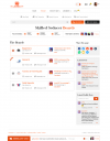
All right fellas, here's the next draft, taking into account your suggestions.

@Tayo, @ZacAdam, I'm afraid you both are still white.

How're we doing with the update?

skilled-seducer-theme-2022-v2.jpg

@Troy, thanks for your detailed reply. I'll have a look. I don't believe Xenforo has any plugins for embedding Google Drive images. Most folks use Imgur, etc. for sharing images. If you want total control, a website domain with shared hosting would give you that too. Perhaps another option there?

Chase
 

Train

Chieftan
tribal-elder
Joined
Feb 3, 2020
Messages
467
I think the gray mitigates the "blank" feel the original design had and the design overall looks clean and modern as well; I like it!
 

Troy

Tool-Bearing Hominid
Joined
Jul 11, 2013
Messages
730
All right fellas, here's the next draft, taking into account your suggestions.

@Tayo, @ZacAdam, I'm afraid you both are still white.

How're we doing with the update?

View attachment 250

@Troy, thanks for your detailed reply. I'll have a look. I don't believe Xenforo has any plugins for embedding Google Drive images. Most folks use Imgur, etc. for sharing images. If you want total control, a website domain with shared hosting would give you that too. Perhaps another option there?

Chase
I prefer the following from the first draft:

1. Members Online - Right at the top of the page. Facebook and Instagram has that feature to show who is online and highlight it at the top of the page. Personally I would follow in their footsteps as they have billions (or trillions or dollars worth of data). Reality is showing who is online is top priority on a forum, especially for the guys who have followed or have built some relationship with others on here.

2. Forum Statistics - This is better right where it was in the first draft. It would be great if the developer added who the new member is though. Statistics are good for branding. While I did mention that I am not big into statistics for a brand I already trust, it is still nice to see these stats. So the first draft is beating out this already.

.........................................................................

Some guys are saying to keep the red alerts. I say use yellow alerts. I worked for Amazon for quite a few years and one of their most subtle driving factors to getting people to take action is using the color yellow. And a company that size, I would follow in their footsteps.

But if others disagree, maybe have a setting where people can change the color of the alerts to whatever they want? Blue, Red, Yellow, etc.

Another thing, the 2nd draft, has too much white space to below "The Boards". Trying to bundle up the latest posts, statistics, members online, and latest profile posts in one row, is pushing everything down further the page. And leaving some irrelevant white space below.

I would say keep the statistics and members online at the top of the page. If others keep disagreeing to put the statistics at the top of the page, then put the statistics directly under "The Boards" to reduce the unnecessary white space. (But keep the members online at the top of the page please).

P.S. @Chase I appreciate how much you care to get direct feedback from us. One key metric I use when building websites for my clients is I use a heat mat to track data overtime. You may be familiar with a heatmat, maybe not.

Basically a heat map shows what specific section of a website people are engaging in the most. This would be a great addition to the websites. For the following reasons:

1. The boards has over 6,000 members. And from the looks of it, less than 5% of active and regular users may even reply to a post like this. They may be busy or something. They may see the post but have no input the share. Or something else.

2. As members login and logout, you will be able to see over the course of a year what features they use the most by how red the heatmap is. And the blue areas would signify certain specific features are not really being used.

3. A heatmap data will allow you to compare the answers we give you with what the computer data gives and that will speed up decision making when improving GirlsChase, Skilled Seducer or any other websites you own.
 
Last edited:

trashKENNUT

Cro-Magnon Man
Cro-Magnon Man
Joined
Nov 20, 2012
Messages
6,553
I can change Avatar.

No problem :) in case it's necessary. If it helps
 
Top
>